Jobcase Community Rebrand
Who is Jobcase
Jobcase is a mission-driven company and its core mission is to support underserved workers in finding jobs and advancing their careers. Jobcase believes in the power of having a mentor-like coach, a strong network, and an impressive profile to succeed. Additionally, it offers employers a marketplace with tools to attract quality candidates.
The problem to solve
Our company faces several challenges necessitating a rebrand. Our current brand image does not align with our expanded offerings, causing audience confusion and weakening our competitive edge. Engagement metrics are declining, and customer feedback shows our brand no longer resonates with their needs, reducing loyalty and satisfaction.Our outdated and inconsistent visual identity weakens brand recognition, and unclear messaging fails to communicate our value propositions. In a competitive market, our brand struggles to stand out, making it hard to attract and retain customers.A rebrand will create a modern, cohesive, and compelling identity, strengthening our market position, enhancing customer engagement, and setting us apart from competitors.
Hypothesis
Rebranding our company will result in a stronger market position, increased customer engagement, and improved brand recognition. By aligning our brand image with our current product and service offerings, modernizing our visual identity, and clarifying our brand messaging, we will enhance customer loyalty and satisfaction, differentiate ourselves from competitors, and ultimately drive business growth.
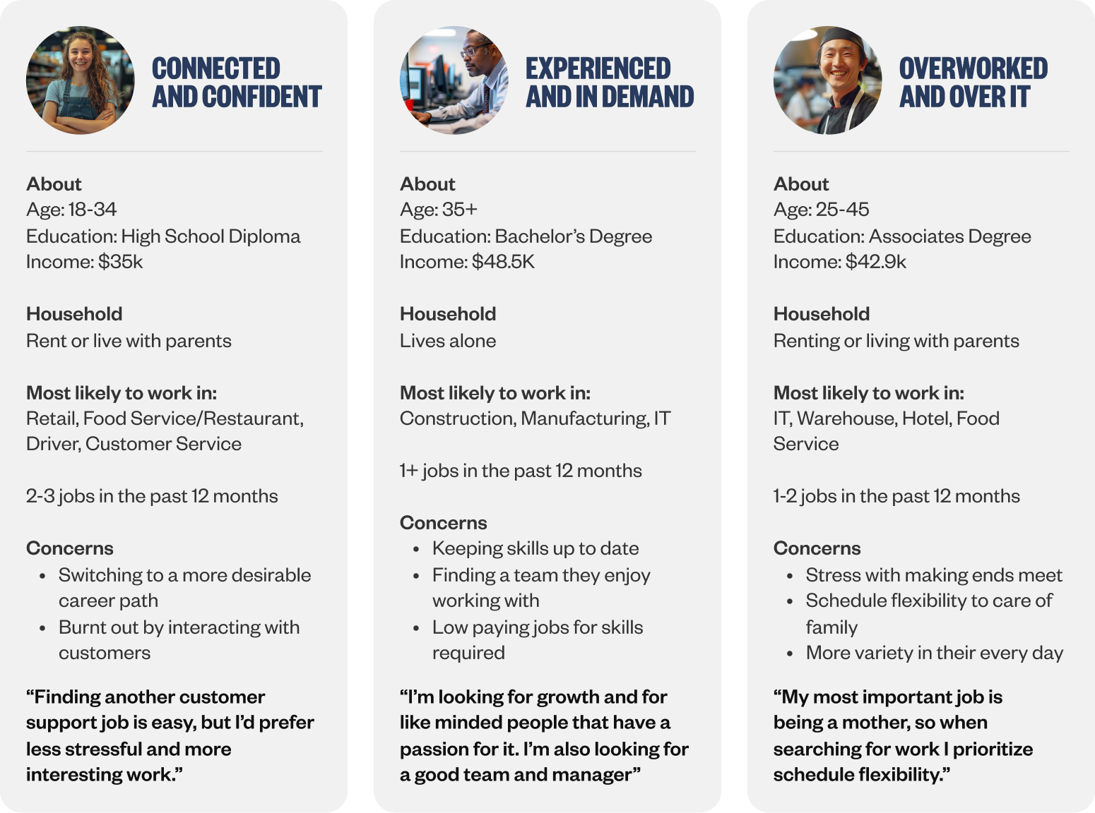
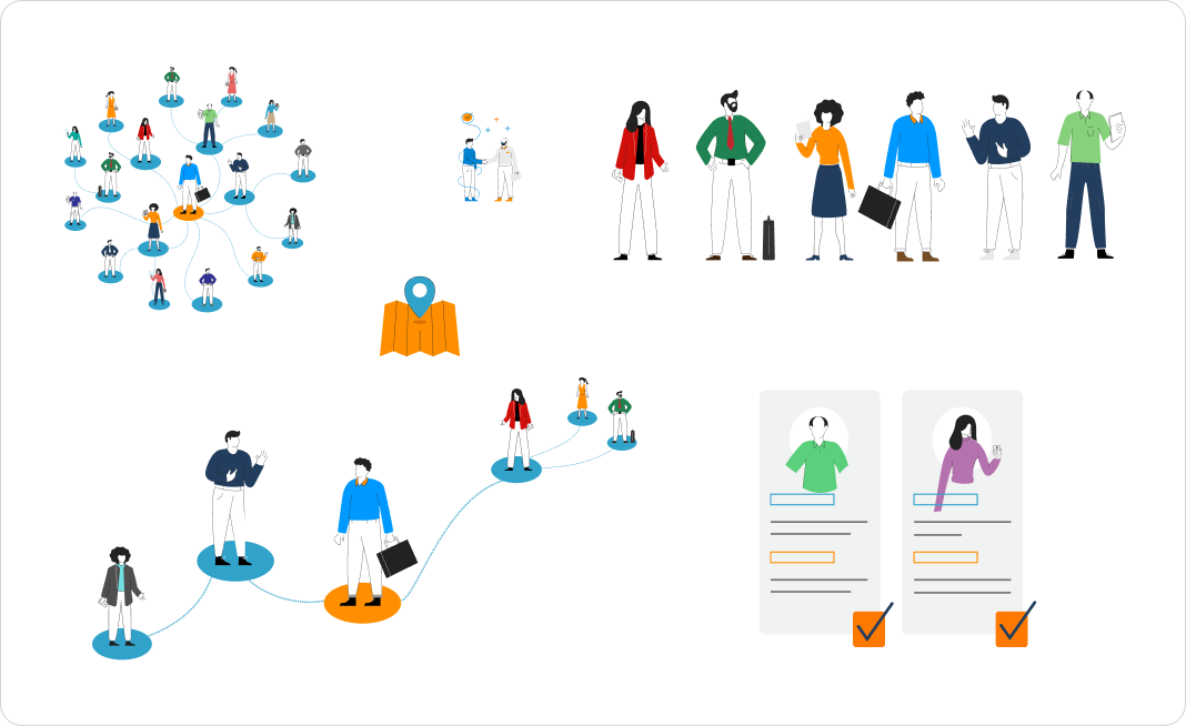
Leveraging Data-Driven Personas for Targeted Product Development
Through extensive market research and the use of Qualtrics, we created detailed marketing personas that became invaluable in shaping our product development. These personas, based on real data and insights, allowed us to deeply understand the challenges faced by different types of workers. By identifying their specific pain points and needs, we were able to prioritize which features to develop first, ensuring that our product addressed the most pressing issues effectively. This targeted approach not only enhanced the relevance of our offerings but also strengthened our commitment to genuinely supporting and empowering the everyday worker.
Outdated and Inconsistent Brand Identity
Our outdated brand no longer resonated with our evolving audience or reflected our current mission. The visuals were inconsistent and failed to convey the innovative and supportive nature of our work. The old logo, typography, and illustrations appeared dated and disconnected, lacking the cohesive story and impact necessary to engage and inspire our target market. Recognizing the need for a complete overhaul, we embarked on a rebranding journey to create a fresh, modern identity that truly embodies our values and commitment to empowering the everyday worker.
Design goals for the rebrand
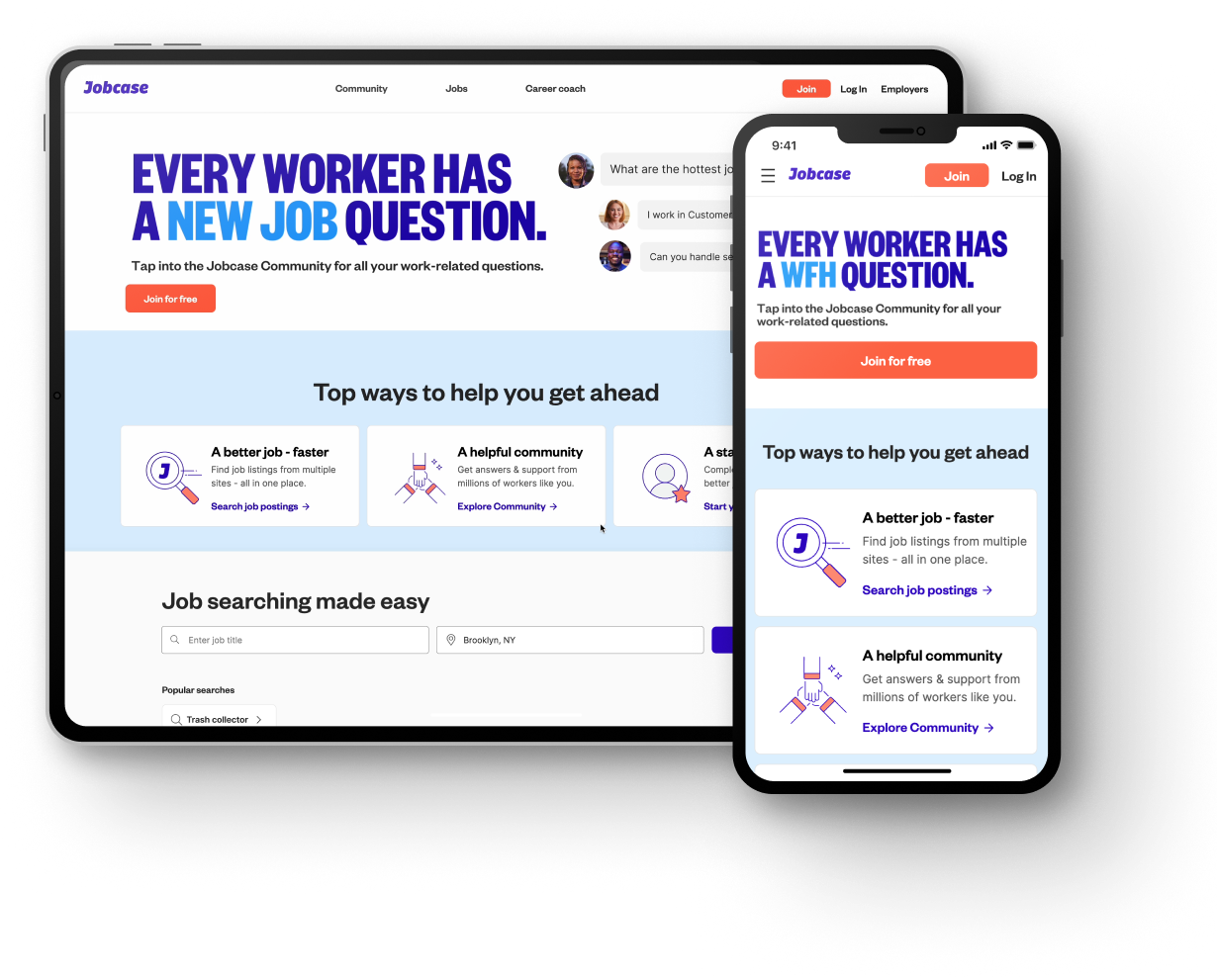
1. Enhance the Website Experience
Revitalize the site's interface by updating iconography, color schemes, input forms, and Gaussian blur effects with customizable placeholders for branding and illustrations.
2. Unify Visual Language
Implement a cohesive design language across all platforms, including JC.com, Employer Center, Jobcase, Inc., and Employer Marketing sites.
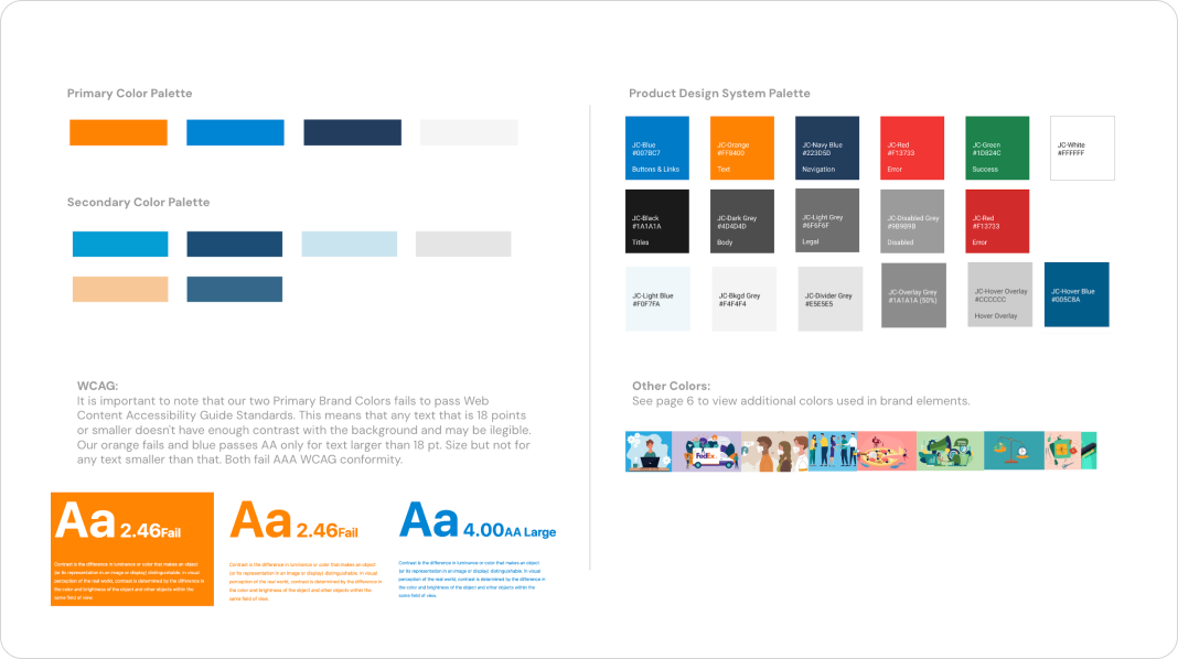
3. Improve Accessibility
Ensure all colors meet WCAG AA standards and introduce focus states for buttons, links, dropdowns, and input fields to enhance accessibility.
4. Clarify Content Presentation
Optimize screen real estate by widening content cards on both mobile and desktop to aid user focus. Introduce ample spacing to clearly separate content blocks.
5. Adopt a Flat UI Design
Maintain a consistent flat UI to complement illustrations, minimizing design and engineering complexity. Use elevation effects sparingly when necessary.
6. Simplify and Streamline
Develop scalable, reusable components to accelerate design production and minimize unique design elements, adhering to atomic design principles.
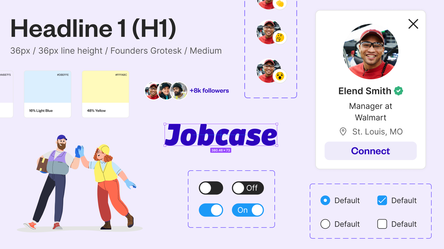
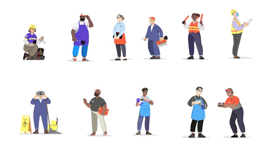
Modernizing and Unifying the Brand Identity
Hiring an agency to develop our logo, typography, and illustrations was a collaborative journey that truly reflected our mission to help the everyday worker. We worked closely with the agency, regularly providing feedback and insights. This partnership blended our understanding of our audience with their creative expertise. Through iterative design and feedback, we crafted a cohesive brand identity that authentically communicates our dedication to empowering and supporting the everyday worker.
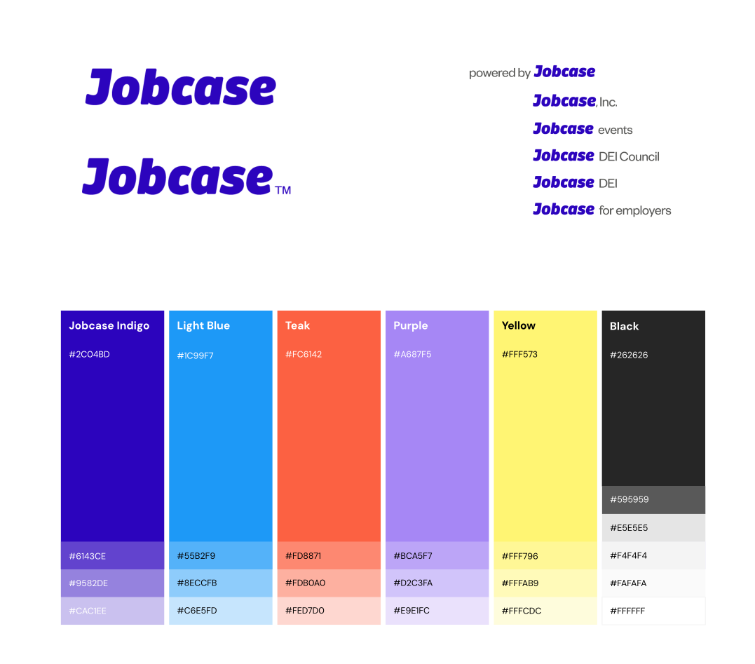

Modernizing and Unifying the Brand Identity
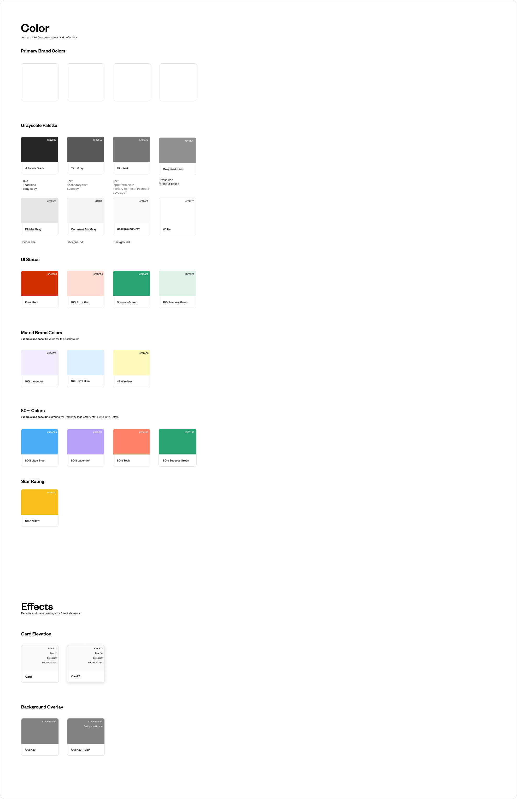
Every component, including variables, was meticulously componentized in adherence to atomic design principles. This approach ensures scalability, consistency, and ease of maintenance, addressing the pitfalls of dated pattern libraries that hinder usability and fail to meet modern accessibility standards. This case study underscores the critical need for updating design frameworks to align with contemporary user needs and inclusivity standards, fostering a more accessible and user-friendly digital experience.
Take a look at the entire design system or view the sample components below:
Project Plan Overview:
Structuring the Path to Success
I guided the team with effective management and proactive problem-solving. Despite the initial challenge of no one fully grasping the depth and complexity of the site, I created timelines and divided the reskinning tasks across different teams: Employer, Identity, Community, Growth, and others. My five designers took ownership of each surface. By fostering collaboration and leveraging team strengths, I helped to navigate these uncertainties smoothly, ensuring the timely completion of deliverables and fostering a creative, productive team environment. There hundreds of pages that needed to be designed for this project.
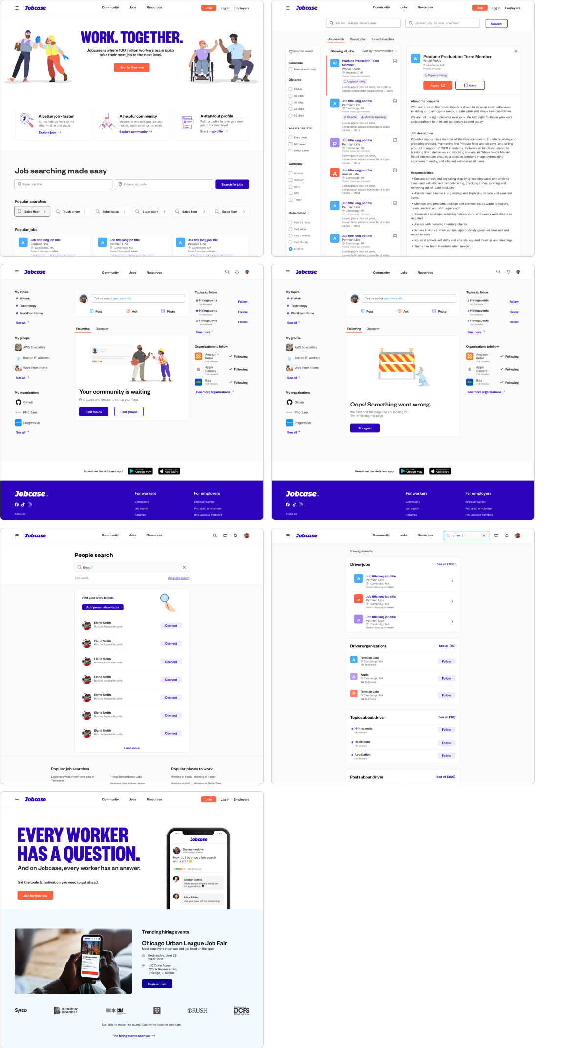
Crafting Intuitive Mobile Screens:
Designing mobile screens involved prioritizing intuitive navigation and engaging empty states. I focused the team on clear menu structure, recognizable icons, and optimized touch interactions. Addressing empty states, we used microcopy and visual cues to guide users effectively, ensuring engagement and usability across devices.
Streamlining Desktop Interfaces: Navigation and Utilization of Space
Designing mobile screens involved prioritizing intuitive navigation and engaging empty states. I focused the team on clear menu structure, recognizable icons, and optimized touch interactions. Addressing empty states, we used microcopy and visual cues to guide users effectively, ensuring engagement and usability across devices.
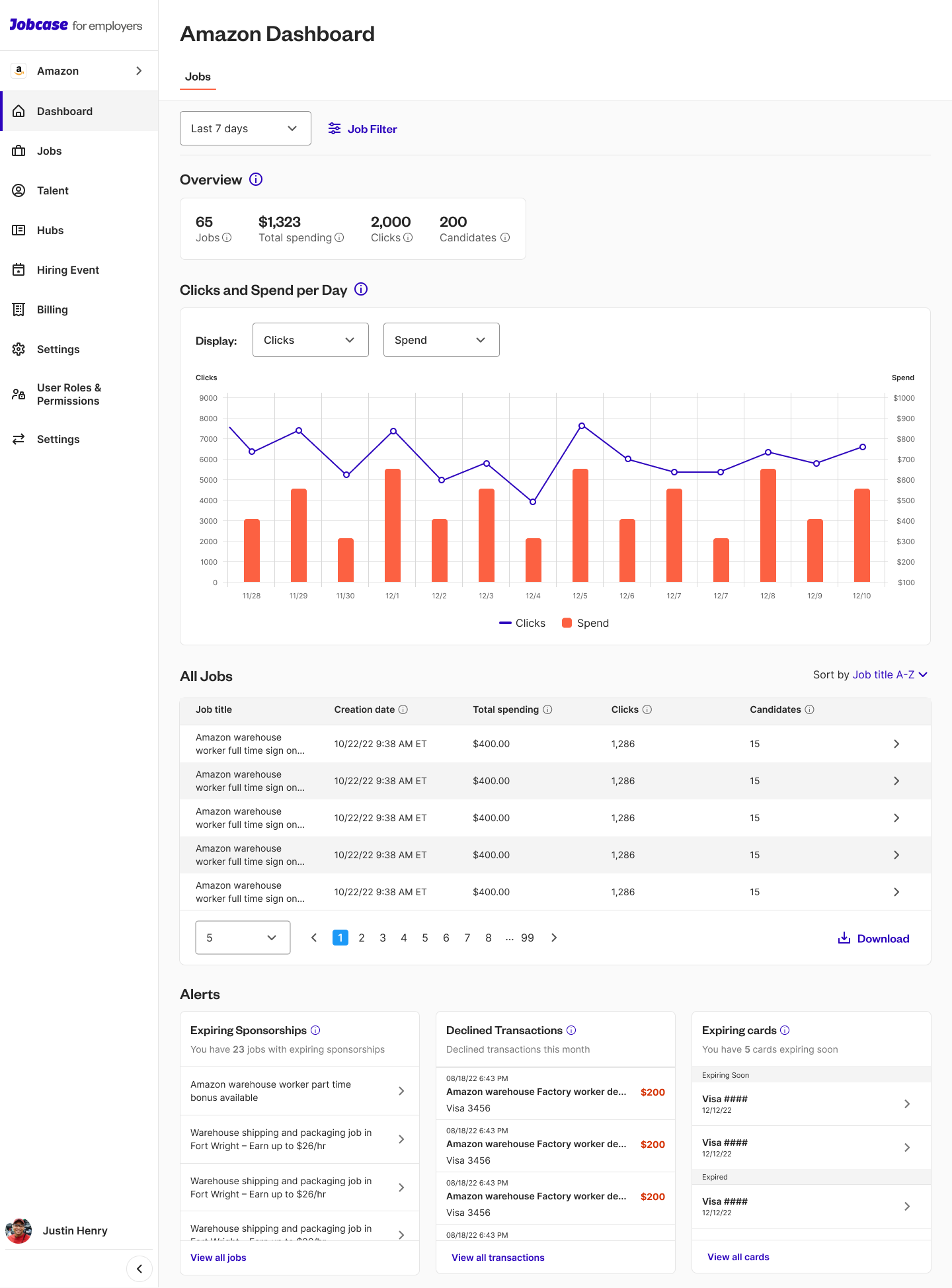
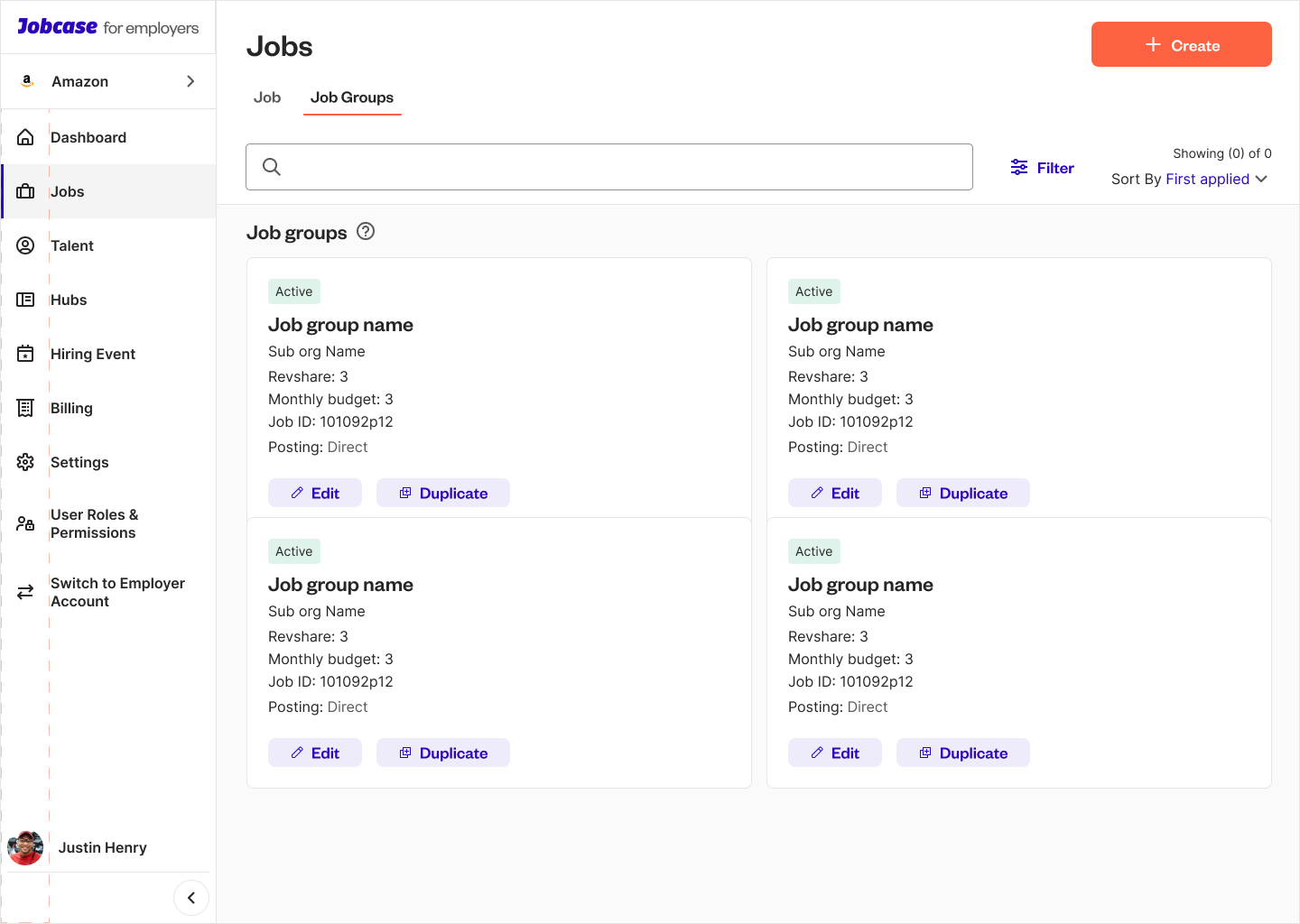
Applying the design to the employer center
Driving Success Through Collaborative Partnerships
In conclusion, the rebrand's success can be attributed to strong partnerships across brand and product design, as well as seamless collaboration with engineering teams. By integrating email designs hand in hand with our overall strategy, we achieved measurable improvements, including a 4% increase in click-through rates (CTR) and enhanced user engagement metrics such as increased time spent on site and reduced drop-off rates in conversion funnels. These achievements underscore the effectiveness of our holistic approach, where cohesive teamwork and strategic alignment across disciplines led to impactful outcomes that enhanced both user experience and business performance.
More case studies
Other important case studies